green candle
What Is a Green Candle?
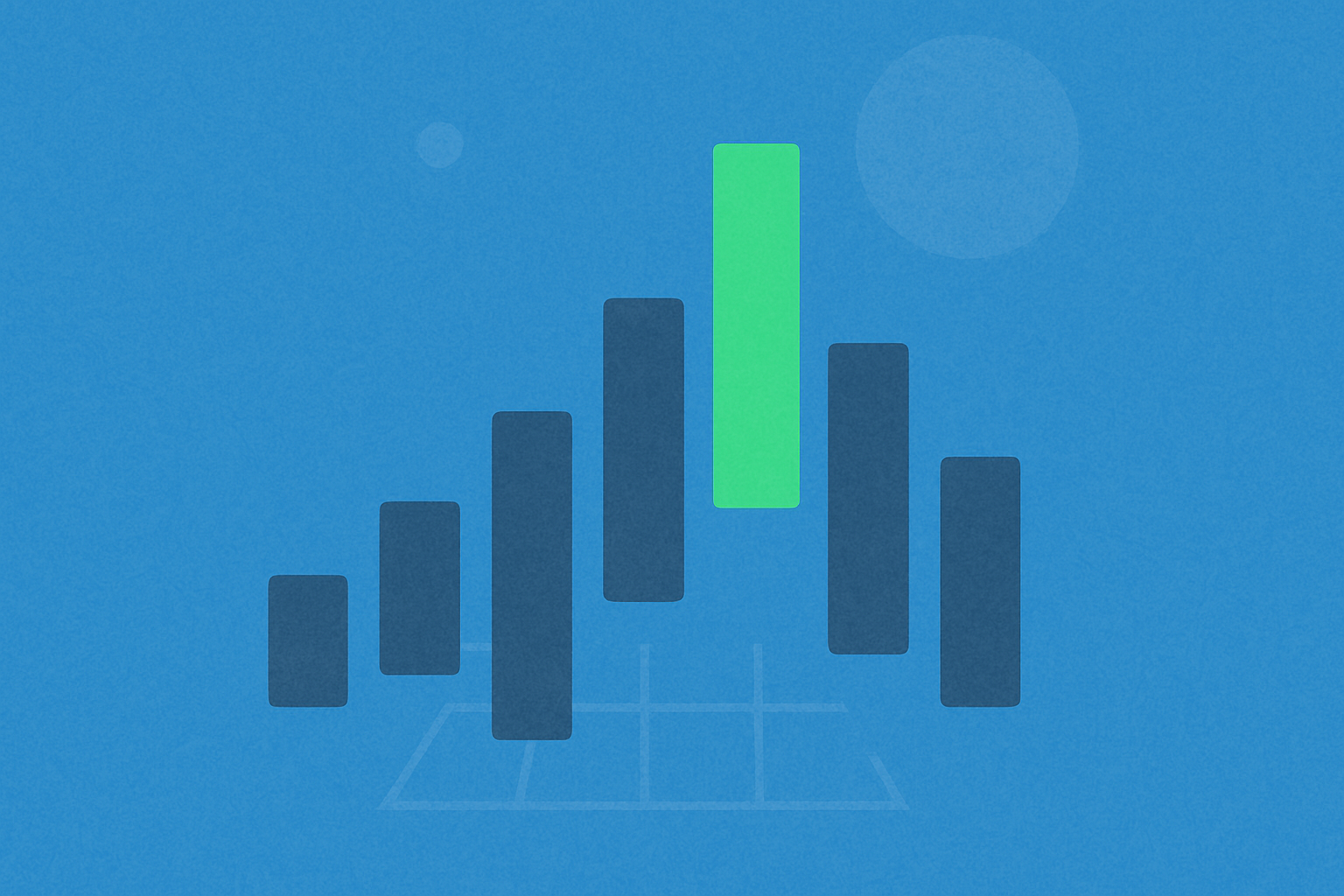
A green candle is a chart bar that indicates the closing price for a given period was higher than the opening price. It appears in candlestick charts (also known as K-line charts), typically colored green or another shade signaling upward movement. The rectangular portion of the candle is called the "body," while the thin lines extending above and below are "wicks" or "shadows," marking the highest and lowest prices during that period.
Candlestick charts serve as a “price diary,” with each candle recording the opening price (price at the start), closing price (price at the end), high, and low for a specific time interval. A green candle reflects that prices trended higher during that period, but does not guarantee continued gains in the future.
What Does a Green Candle Represent in K-Line Charts?
A green candle signals that buyers dominated during that time frame, driving prices from the open to a higher close. It represents “net upward movement” for the period, but is not a prediction of future price action.
The meaning of a green candle depends on context: In an ongoing uptrend, it may indicate trend continuation; after a downtrend, it could suggest a rebound attempt; near resistance levels, it may simply be testing previous highs without a breakout. Understanding the candle’s position within broader price action is key to accurate interpretation.
What Do the Length and Shadows of a Green Candle Indicate?
The longer the body of a green candle, the stronger and more concentrated the buying pressure during that period; a shorter body shows prices closed higher but with limited net movement.
The wicks represent price volatility: A long upper wick suggests selling pressure pushed prices down from highs; a long lower wick shows buyers stepped in at lower prices, pulling them up. A candle with a long body and short wicks typically signals strong directional momentum, while short bodies and long wicks indicate heightened volatility and market indecision.
How Do Green Candles Differ Across Time Frames?
A candle’s time frame refers to the period each candle covers—such as one minute, one hour, or one day. Shorter intervals provide more granular information but are noisier; longer intervals reveal clearer trends but may slow entry and exit decisions.
The same green candle can mean different things across time frames: A long body on a five-minute chart might be just a minor fluctuation on the daily chart; on a daily chart, a long-bodied green candle usually signifies buyers dominated that day. A common approach is “multi-timeframe analysis”: establish trend direction on higher time frames and pinpoint entries on lower time frames.
How to Use Volume with Green Candles to Assess Strength?
Volume measures the amount traded during that period and indicates market participation. Large green candles accompanied by rising volume are more convincing, as increased trading activity confirms genuine buyer involvement rather than fleeting price spikes.
Green candles lacking volume often occur during periods of low liquidity and are less reliable. If a green candle breaks above a previous high (key resistance) with significant volume increase, the breakout is more likely to hold; conversely, if volume is weak during such moves, pullbacks are more probable.
How to Trade Using Green Candles on Gate?
Step 1: Open Gate’s Spot or Contract Trading page, choose your trading pair, access the chart, and switch to candlestick view. Set your preferred timeframes (e.g., 1-hour and daily) for multi-timeframe analysis.
Step 2: Activate the “Volume” indicator at the bottom right of the chart to see if green candles coincide with rising volume—a key signal for confirming strength.
Step 3: Use charting tools to mark key support and resistance levels. Support zones are areas where prices have historically rebounded; resistance zones are where upward moves have repeatedly stalled. Highlight previous highs and lows to define critical reference points.
Step 4: Develop your trading plan. If a green candle forms above support with rising volume, consider entering when the next candle retests support and holds. If near resistance you see a green candle with only a long upper wick, be cautious—wait for clear breakout confirmation with strong volume.
Step 5: Manage risk. Set stop-loss and take-profit orders (using conditional orders or stop-loss features), control position size, and ensure risk per trade is manageable. Crypto assets can be highly volatile, so no single indicator guarantees results.
What Are Common Risks of Misinterpreting Green Candles?
Typical mistakes include treating a single green candle as sufficient evidence of reversal, ignoring key resistance levels and overall context, overlooking volume confirmation, focusing only on low-timeframe signals while missing higher-timeframe trends, chasing rallies after extended moves, or failing to set stop-losses.
To avoid these pitfalls, incorporate green candles into a holistic framework: assess position (support/resistance), volume, structure (body and wicks), and timeframe rhythm before executing trades. Limit potential losses with prudent position sizing and stop-losses.
How Do Green Candles Compare with Red Candles?
Red candles indicate the closing price was lower than the opening price—showing sellers were dominant; green candles are the opposite, reflecting buyer strength. Comparing both allows traders to gauge who controls market momentum at any given time.
During uptrends, green candles predominate; in pullbacks, red candles increase. The comparison is especially meaningful at key levels: after breaking previous highs, green candles with rising volume signal trend extension; after breaking support, red candles with strong volume point to further weakness. The goal is not predicting guaranteed outcomes but enhancing situational awareness.
Key Takeaways on Green Candles
A green candle shows “close above open,” signaling buyer dominance for that interval. Interpretation requires considering its position (near support or resistance), structure (body/wick composition), timeframe (short-term noise vs. long-term direction), and volume (confirmation through increased activity). On Gate, analyze charts before planning trades, then manage risk via conditional orders, stop-losses, and position sizing. No single indicator guarantees returns—successful trading relies on integrated analysis and disciplined execution.
FAQ
Should I always buy when I see a green candle?
Not necessarily. A green candle simply means prices rose during that period; it does not guarantee further gains. Always consider overall trend, support/resistance zones, volume, and other factors before making decisions—a single green candle is not a strong buy signal. Beginners often chase rallies just because they see green candles; this is a common mistake.
Why do some green candles have long upper wicks?
A long upper wick means prices climbed high during that interval but were pushed back down before close—indicating buyer strength was insufficient or met selling pressure. Such green candles reflect resistance at higher levels and may signal potential corrections ahead.
What does it mean if several green candles appear consecutively over a short period?
A series of consecutive green candles usually shows sustained buyer dominance and an uptrend in progress. However, check if trading volume also increases and whether the rally has already run far—if prices have risen several days in a row, risks may be accumulating and a pullback could be near.
What does it mean if prices drop sharply right after a green candle appears?
This often signals a reversal—although buyers drove prices up in one period, their strength has faded and sellers have taken control. Such reversals are particularly noteworthy if they occur near highs or after extended uptrends; they may present opportunities for short trades or profit-taking.
How should beginners use green candles to inform trading decisions?
Treat green candles as trend indicators rather than buy signals. First learn to interpret multi-candle formations (like consecutive rises or double tops), then combine this with analysis of K-line positions (such as breaking key resistance) and trading volume. Always set stop-losses on platforms like Gate to manage risk. Building trading discipline gradually is more important than rushing into trades.
Related Articles
Exploring 8 Major DEX Aggregators: Engines Driving Efficiency and Liquidity in the Crypto Market
What Is Copy Trading And How To Use It?